Elm ligature. Solar patterned script
Elm is a type of writing in which the letters are brought closer together or connected to one another and linked into a continuous pattern
There are simple, complex and patterned ligatures. Common techniques when working with ligature are:
Ligature: a connection of two or more letters that have a common (merged) part;
reducing individual letters and distributing them in spaces between non-reduced letters;
subordination: writing a small letter under any part or between the strokes of a capital letter;
subordination: writing two or more reduced ones, one below the other;
shortening parts of letters in order to bring them closer to each other;
These techniques were largely known in Byzantium and among the southern Slavs, but they found especially wide application in Russian writing. Elm was used to shorten writing when there was not enough space (entry 1512 on the border of the embroidered shroud of the Ryazan Museum), and occasionally even entire manuscripts were written with it (for example, Codex Chudovsky collection No. 13).
However, in addition to business purposes, ligature was used - especially among Russians - for aesthetic purposes. Elements of ligature are combined with purely ornamental motifs in the arabesque style. The voids in a line of ligature are usually filled with decorations. Of these, the following are distinguished: branch, arrow, peephole, curl, cross, leaf, rays, curl, antennae, proboscis, thorn. In this often difficult to read, coherent letter, the semantic side recedes into the background.

Ornamental script developed in Byzantium in the middle of the 11th century, but it was an easy to read script, quite broad, with simple technical techniques. From the first half of the 13th century, Byzantine script formed the basis of the script of the South Slavs, who by the end of the 14th century - the time of the South Slavic influence on Russian writing - developed the styles of this artistic writing. South Slavic script is also not difficult to read and does not represent much complexity in the composition of its constituent parts.
In Russian books, ligature appeared at the end of the 14th century. By the end of the 15th century, ligature became a favorite calligraphic technique in the design of Russian handwritten books. At this time, Pskov and Novgorod became hotbeds of the art of ligature, and in the center of Rus' - the Trinity-Sergius Monastery. The best examples of script were created in the middle of the 16th century in Moscow under Ivan IV in the calligraphy workshop headed by Metropolitan Macarius, as well as in Novgorod. Books published by the pioneer Russian printer Ivan Fedorov are famous for their printed script.
In Rus', during the 15th-16th centuries, ornamental script quickly evolved. The lowercase letters of the script stretched out so that the height of the letters began to exceed their width by 10 times. In the 17th century, Moscow scribes knew hundreds of different combinations of letter styles, but from the end of this century, further changes in the field of ligature occurred only in the Old Believer environment, especially in the schools of Pomeranian writing, which evolved noticeably even in the 19th century.
Ornamental script was widely used on objects closely related to the everyday life and social life of Rus': the titles of articles and individual parts in books were often written with it, it is common in gravestone inscriptions, on objects of religious worship, and is found on household metal and wooden utensils, furniture, etc. The evolution of ligature depended on the development and nature of the technique of working on different materials: ligature written in books, carved on stone or bone, sewn on fabrics, written on wood has unique differences. In this regard, we find significant differences in this letter in different cultural centers. The widespread development of production technology in Moscow in the 16th-17th centuries explains to us to a large extent the extreme complexity of Moscow ornamental script in the 17th century. 
The result is the prayer “It is worthy to eat,” which is still valid in church services to this day:
“It is worthy to truly bless You, the Mother of God, the Ever-Blessed and Most Immaculate and the Mother of our God. We honor You, the most honorable Cherub and the most glorious without comparison Seraphim, who gave birth to God the Word without corruption.”


Analysis of the ligature of Ermak’s banner
The collection of relics of the Armory Chamber contains three blue banners of Ermak, under which he conquered the Siberian Khanate of Kuchum in 1582.
The banners are more than 3 arshins (2 meters) long. On one there are embroidered images of Joshua and St. Mikhail (see Fig. 1). On the other two are a lion and a unicorn, ready for battle.
The subject of the image is a scene from the Old Testament. After the death of Moses, Joshua becomes the leader of Israel. On the eve of the capture of Jericho, he sees a man with a sword in his hand - the leader of the heavenly army. “Take off your shoes, for the place on which you stand is holy,” says the celestial. The image shows the exact moment when Jesus takes off his shoes.
The same scene is depicted on the banner of Dmitry Pozharsky (see Elm of the banner of Dmitry Pozharsky) with minor differences in details, of which the most significant is that on the banner of Ermak Joshua is depicted as an ordinary person (without a halo), and on the banner of Dmitry Pozharsky he already a saint (with a halo).


There is very little factual data about the time and conditions of the emergence and development of Slavic writing. The opinions of scientists on this issue are contradictory.
In the middle of the 1st millennium AD. e. The Slavs settled vast territories in Central, Southern and Eastern Europe. Their neighbors in the south were Greece, Italy, Byzantium - a kind of cultural standards of human civilization.
Young Slavic “barbarians” constantly violated the borders of their southern neighbors. To curb them, Rome and Byzantium decided to convert the “barbarians” to the Christian faith, subordinating their daughter churches to the main one - the Latin one in Rome, the Greek one in Constantinople. Missionaries began to be sent to the “barbarians.” The messengers of the church sincerely and confidently fulfilled their spiritual duty, and the Slavs themselves, living in close contact with the European medieval world, were increasingly inclined to the need to enter the fold of the Christian church, and at the beginning of the 9th century they began to accept Christianity.
But how can the holy scriptures, prayers, letters of the apostles, and the works of the church fathers be made accessible to converts? The Slavic language, differing in dialects, remained unified for a long time, but the Slavs did not yet have their own written language. “Before, the Slavs, when they were pagans, did not have letters,” says the Legend of the Monk Khrabra “On Letters,” “but they [counted] and told fortunes with the help of features and cuts.” However, during trade transactions, when accounting for the economy, or when it was necessary to accurately convey some message, and even more so during a dialogue with the old world, it is unlikely that “traits and cuts” were enough. There was a need to create Slavic writing.


The letter “devils and cuts” - Slavic runes - is a writing system that, according to some researchers, existed among the ancient Slavs before the baptism of Rus'. Runes were usually used for short inscriptions on gravestones, on border markers, on weapons, jewelry, coins, and very rarely on linen or parchment. “When [the Slavs] were baptized,” said the Monk Khrabr, “they tried to write down Slavic speech in Roman [Latin] and Greek letters without order.” These experiments have partially survived to this day: the main prayers, sounding in Slavic, but written in Latin letters in the 10th century, were common among the Western Slavs. Other interesting monuments are also known - documents in which Bulgarian texts are written in Greek letters, from the times when the Bulgarians still spoke the Turkic language (later the Bulgarians will speak Slavic).
And yet, neither the Latin nor the Greek alphabet corresponded to the sound palette of the Slavic language. Words whose sound cannot be correctly conveyed in Greek or Latin letters were already cited by the Monk Khrabr: belly, tsrkvi, aspiration, youth, language and others. In addition, another side of the problem has emerged - political. Latin missionaries did not strive to make the new faith understandable to Slavic believers. It was a common belief in the Roman Church that there were “only three languages in which it is proper to glorify God with the help of (special) writing: Hebrew, Greek and Latin.” Rome firmly adhered to the position that the “secret” of Christian teaching should be known only to the clergy, and that for ordinary Christians, very few specially processed texts - the rudiments of Christian knowledge - were sufficient.
In Byzantium they looked at this somewhat differently, and began to think about creating a Slavic alphabet. “My grandfather, and my father, and many others looked for them and did not find them,” Emperor Michael III will say to the future creator of the Slavic alphabet, Constantine the Philosopher. It was Constantine the Philosopher who he called upon when, in the early 860s, an embassy of Slavs from Moravia (part of the territory of modern Czech Republic) came to Constantinople. The top of Moravian society adopted Christianity three decades ago, but the German church was active among them. Apparently, trying to gain complete independence, the Moravian prince Rostislav asked “a teacher to explain to us the right faith in our language...”, i.e. create your own alphabet for them.
“No one can accomplish this deed, only you,” the Tsar admonished Constantine the Philosopher. This difficult, honorable mission fell simultaneously on the shoulders of his brother, abbot (abbot) of the Orthodox monastery - Methodius. “You are Thessalonians, and the Solunians all speak pure Slavic,” the emperor gave another argument.
Constantine (consecrated Cyril) and Methodius (his secular name is unknown) are two brothers who stood at the origins of Slavic writing. They came from the Greek city of Thessaloniki (its modern name is Thessaloniki) in northern Greece. The southern Slavs lived in the neighborhood, and for the inhabitants of Thessalonica, the Slavic language apparently became the second language of communication.
Konstantin and his brother were born into a large, wealthy family with seven children. She belonged to a noble Greek family: the head of the family, named Leo, was revered as an important person in the city. Konstantin was the youngest. As a seven-year-old child (as his Life tells it), he saw a “prophetic dream”: he had to choose his wife from all the girls in the city. And he pointed to the most beautiful: “her name was Sophia, that is, Wisdom.” The boy's phenomenal memory and unique abilities amazed those around him.
Having learned about the special talent of the children of the Solunsky nobleman, the ruler of the Tsar called them to Constantinople. Here they received an excellent education for that time. With his knowledge and wisdom, Konstantin earned himself honor, respect and the nickname “Philosopher”. He became famous for his many verbal victories: in discussions with bearers of heresies, at a debate in Khazaria, where he defended the Christian faith, knowledge of many languages and reading ancient inscriptions. In Chersonesus, in a flooded church, Constantine discovered the relics of St. Clement, and through his efforts they were transferred to Rome. Constantine's brother Methodius often accompanied him and helped him in business.
The brothers received world fame and gratitude from their descendants for the creation of the Slavic alphabet and translations of sacred books into Slavic. A huge work that played an epoch-making role in the formation of Slavic peoples.
However, many researchers believe that work began on the creation of a Slavic script in Byzantium, long before the arrival of the Moravian embassy. Creating an alphabet that accurately reflects the sound composition of the Slavic language, and translating the Gospel into the Slavic language - a complex, multi-layered, internally rhythmic literary work - is a colossal work. To complete this work, even Constantine the Philosopher and his brother Methodius “with his henchmen” would have taken more than one year. Therefore, it is natural to assume that it was precisely this work that the brothers performed back in the 50s of the 9th century in a monastery on Olympus (in Asia Minor on the coast of the Sea of Marmara), where, as the Life of Constantine reports, they constantly prayed to God, “practicing only books."
Already in 864, Constantine and Methodius were received with great honors in Moravia. They brought the Slavic alphabet and the Gospel translated into Slavic. Students were assigned to help the brothers and teach them. “And soon (Constantine) translated the entire church rite and taught them matins, and the hours, and mass, and vespers, and compline, and secret prayer.” The brothers stayed in Moravia for more than three years. The philosopher, already suffering from a serious illness, 50 days before his death, “put on the holy monastic image and... gave himself the name Cyril...”. He died and was buried in Rome in 869.
The eldest of the brothers, Methodius, continued the work he had started. As “The Life of Methodius” reports, “...having appointed cursive writers from his two priests as disciples, he translated incredibly quickly (in six or eight months) and completely all the books (biblical), except the Maccabees, from Greek into Slavic.” Methodius died in 885.
The appearance of sacred books in the Slavic language had a powerful resonance. All known medieval sources that responded to this event report how “certain people began to blaspheme Slavic books,” arguing that “no people should have their own alphabet, except the Jews, Greeks and Latins.” Even the Pope intervened in the dispute, grateful to the brothers who brought the relics of St. Clement to Rome. Although the translation into the uncanonized Slavic language was contrary to the principles of the Latin Church, the pope nevertheless condemned the detractors, allegedly saying, quoting Scripture, this way: “Let all nations praise God.”
Not one Slavic alphabet has survived to this day, but two: Glagolitic and Cyrillic. Both existed in the 9th-10th centuries. In them, to convey sounds reflecting the features of the Slavic language, special characters were introduced, and not combinations of two or three main ones, as was practiced in the alphabets of Western European peoples. Glagolitic and Cyrillic almost have the same letters. The order of the letters is also almost the same.
As in the very first such alphabet - the Phoenician, and then in Greek, Slavic letters were also given names. And they are the same in Glagolitic and Cyrillic. According to the first two letters of the alphabet, as is known, the name “alphabet” was compiled. Literally it is the same as the Greek “alphabeta”, that is, “alphabet”.
The third letter is “B” - lead (from “to know”, “to know”). It seems that the author chose the names for the letters in the alphabet with meaning: if you read the first three letters of “az-buki-vedi” in a row, it turns out: “I know the letters.” In both alphabets, letters also had numerical values assigned to them.

The letters in the Glagolitic and Cyrillic alphabet had completely different shapes. Cyrillic letters are geometrically simple and easy to write. The 24 letters of this alphabet are borrowed from the Byzantine charter letter. Letters were added to them, conveying the sound features of Slavic speech. The added letters were constructed in such a way as to maintain the general style of the alphabet. For the Russian language, it was the Cyrillic alphabet that was used, transformed many times and now established in accordance with the requirements of our time. The oldest record made in Cyrillic was found on Russian monuments dating back to the 10th century.
But the Glagolitic letters are incredibly intricate, with curls and loops. There are more ancient texts written in the Glagolitic alphabet among the Western and Southern Slavs. Oddly enough, sometimes both alphabets were used on the same monument. On the ruins of the Simeon Church in Preslav (Bulgaria) an inscription dating back to approximately 893 was found. In it, the top line is in Glagolitic alphabet, and the two lower lines are in Cyrillic alphabet. The inevitable question is: which of the two alphabets did Constantine create? Unfortunately, it was not possible to definitively answer it.


1. Glagolitic (X-XI centuries)

We can only judge tentatively about the oldest form of the Glagolitic alphabet, because the monuments of the Glagolitic alphabet that have reached us are no older than the end of the 10th century. Peering at the Glagolitic alphabet, we notice that the shapes of its letters are very intricate. Signs are often built from two parts, located as if on top of each other. This phenomenon is also noticeable in the more decorative design of the Cyrillic alphabet. There are almost no simple round shapes. They are all connected by straight lines. Only single letters correspond to the modern form (w, y, m, h, e). Based on the shape of the letters, two types of Glagolitic alphabet can be noted. In the first of them, the so-called Bulgarian Glagolitic, the letters are rounded, and in the Croatian, also called Illyrian or Dalmatian Glagolitic, the shape of the letters is angular. Neither type of Glagolitic alphabet has sharply defined boundaries of distribution. In its later development, the Glagolitic alphabet adopted many characters from the Cyrillic alphabet. The Glagolitic alphabet of the Western Slavs (Czechs, Poles and others) lasted relatively short-lived and was replaced by the Latin script, and the rest of the Slavs later switched to a Cyrillic-type script. But the Glagolitic alphabet has not completely disappeared to this day. So, it was used before the start of the Second World War in the Croatian settlements of Italy. Even newspapers were printed in this font.
2. Charter (Cyrillic 11th century)

The origin of the Cyrillic alphabet is also not completely clear. There are 43 letters in the Cyrillic alphabet. Of these, 24 were borrowed from the Byzantine charter letter, the remaining 19 were reinvented, but in graphic design they are similar to the Byzantine ones. Not all borrowed letters retained the designation of the same sound as in the Greek language; some received new meanings in accordance with the peculiarities of Slavic phonetics. Of the Slavic peoples, the Bulgarians preserved the Cyrillic alphabet the longest, but at present their writing, like the writing of the Serbs, is similar to Russian, with the exception of some signs intended to indicate phonetic features. The oldest form of the Cyrillic alphabet is called ustav. A distinctive feature of the charter is the sufficient clarity and straightforwardness of the outline. Most of the letters are angular, broad and heavy in nature. Exceptions are narrow rounded letters with almond-shaped curves (O, S, E, R, etc.), among other letters they seem to be compressed. This letter is characterized by thin lower extensions of some letters (P, U, 3). We see these extensions in other types of Cyrillic. They act as light decorative elements in the overall picture of the letter. Diacritics are not yet known. The letters of the charter are large in size and stand separately from each other. The old charter does not know spaces between words.
Ustav - the main liturgical font - clear, straight, harmonious, is the basis of all Slavic writing. These are the epithets with which V.N. describes the charter letter. Shchepkin: “The Slavic charter, like its source - the Byzantine charter, is a slow and solemn letter; it aims at beauty, correctness, church splendor.” It is difficult to add anything to such a capacious and poetic definition. The statutory letter was formed during the period of liturgical writing, when rewriting a book was a godly, unhurried task, taking place mainly behind the monastery walls, far from the bustle of the world.
The greatest discovery of the 20th century - Novgorod birch bark letters indicate that writing in Cyrillic was a common element of Russian medieval life and was owned by various segments of the population: from princely-boyars and church circles to simple artisans. The amazing property of the Novgorod soil helped preserve birch bark and texts that were not written with ink, but were scratched with a special “writing” - a pointed rod made of bone, metal or wood. Such tools in large quantities were found even earlier during excavations in Kyiv, Pskov, Chernigov, Smolensk, Ryazan and at many ancient settlements. The famous researcher B. A. Rybakov wrote: “A significant difference between Russian culture and the culture of most countries of the East and West is the use of the native language. The Arabic language for many non-Arab countries and the Latin language for a number of Western European countries were alien languages, the monopoly of which led to the fact that the popular language of the states of that era is almost unknown to us. The Russian literary language was used everywhere - in office work, diplomatic correspondence, private letters, in fiction and scientific literature. The unity of the national and state languages was a great cultural advantage of Rus' over the Slavic and Germanic countries, in which the Latin state language dominated. Such widespread literacy was impossible there, since to be literate meant knowing Latin. For Russian townspeople, it was enough to know the alphabet in order to immediately express their thoughts in writing; This explains the widespread use in Rus' of writing on birch bark and on “boards” (obviously waxed).”
3. Half-statut (XIV century)

Starting from the 14th century, a second type of writing developed - semi-ustav, which subsequently replaced the charter. This type of writing is lighter and more rounded than the charter, the letters are smaller, there are a lot of superscripts, and a whole system of punctuation marks has been developed. The letters are more mobile and sweeping than in the statutory letter, and with many lower and upper extensions. The technique of writing with a broad-nib pen, which was strongly evident when writing with the rules, is noticeable much less. The contrast of strokes is less, the pen is sharpened sharper. They use exclusively goose feathers (previously they used mainly reed feathers). Under the influence of the stabilized position of the pen, the rhythm of the lines improved. The letter takes on a noticeable slant, each letter seems to help the overall rhythmic direction to the right. Serifs are rare; the end elements of a number of letters are decorated with strokes equal in thickness to the main ones. The semi-statut existed as long as the handwritten book lived. It also served as the basis for the fonts of early printed books. Poluustav was used in the 14th-18th centuries along with other types of writing, mainly cursive and ligature. It was much easier to write half-tired. The feudal fragmentation of the country caused in remote areas the development of their own language and their own semi-rut style. The main place in the manuscripts is occupied by the genres of military stories and chronicles, which best reflected the events experienced by the Russian people in that era.
The emergence of semi-usta was predetermined mainly by three main trends in the development of writing:
The first of them is the emergence of a need for non-liturgical writing, and as a consequence the emergence of scribes working to order and for sale. The writing process becomes faster and easier. The master is more guided by the principle of convenience rather than beauty. V.N. Shchepkin describes the semi-ustav as follows: “... smaller and simpler than the charter and has significantly more abbreviations;... it can be inclined - towards the beginning or end of the line, ... straight lines allow some curvature, rounded ones do not represent a regular arc.” The process of dissemination and improvement of the semi-ustav leads to the fact that the ustav is gradually being replaced even from liturgical monuments by the calligraphic semi-ustav, which is nothing more than a semi-ustav written more accurately and with fewer abbreviations. The second reason is the need of monasteries for inexpensive manuscripts. Delicately and modestly decorated, usually written on paper, they contained mainly ascetic and monastic writings. The third reason is the appearance during this period of voluminous collections, a kind of “encyclopedia about everything.” They were quite thick in volume, sometimes sewn and assembled from various notebooks. Chroniclers, chronographs, walks, polemical works against the Latins, articles on secular and canon law, side by side with notes on geography, astronomy, medicine, zoology, mathematics. Collections of this kind were written quickly, not very carefully, and by different scribes.

Cursive writing (XV-XVII centuries)

In the 15th century, under the Grand Duke of Moscow Ivan III, when the unification of Russian lands ended and the national Russian state was created with a new, autocratic political system, Moscow turned not only into the political, but also the cultural center of the country. The previously regional culture of Moscow begins to acquire the character of an all-Russian one. Along with the increasing demands of everyday life, the need arose for a new, simplified, more convenient writing style. Cursive writing became it. Cursive writing roughly corresponds to the concept of Latin italic. The ancient Greeks used cursive writing in wide use at the early stage of the development of writing, and it was also partially used by the southwestern Slavs. In Russia, cursive writing as an independent type of writing arose in the 15th century. Cursive letters, partially related to each other, differ from letters of other types of writing in their light style. But since the letters were equipped with many different symbols, hooks and additions, it was quite difficult to read what was written. Although the cursive writing of the 15th century still reflects the character of the semi-ustav and there are few strokes connecting the letters, but in comparison with the semi-ustav this letter is more fluent. Cursive letters were largely made with extensions. At first, the signs were composed mainly of straight lines, as is typical for the charter and semi-charter. In the second half of the 16th century, and especially at the beginning of the 17th century, semicircular strokes became the main lines of writing, and in the overall picture of writing we see some elements of Greek italics. In the second half of the 17th century, when many different writing options spread, cursive writing showed features characteristic of that time - less ligature and more roundness.

If semi-ustav in the 15th-18th centuries was mainly used only in book writing, then cursive writing penetrates into all areas. It turned out to be one of the most flexible types of Cyrillic writing. In the 17th century, cursive writing, distinguished by its special calligraphy and elegance, turned into an independent type of writing with its inherent features: the roundness of the letters, the smoothness of their outline, and most importantly, the ability for further development.
Already at the end of the 17th century, such forms of letters “a, b, c, e, z, i, t, o, s” were formed, which subsequently underwent almost no changes.
At the end of the century, the round outlines of the letters became even more smooth and decorative. The cursive writing of that time is gradually freed from the elements of Greek italics and moves away from the forms of semi-character. In the later period, straight and curved lines acquired balance, and letters became more symmetrical and rounded. At the time when the half-rut is transformed into a civil letter, cursive writing also follows a corresponding path of development, as a result of which it can later be called civil cursive writing. The development of cursive writing in the 17th century predetermined Peter's alphabet reform.
Elm.
One of the most interesting directions in the decorative use of the Slavic charter is ligature. According to the definition of V.N. Shchepkina: “Elm is the name given to Kirill’s decorative script, which aims to link a line into a continuous and uniform pattern. This goal is achieved by various kinds of abbreviations and embellishments.” The script writing system was borrowed by the southern Slavs from Byzantium, but much later than the emergence of Slavic writing and therefore it is not found in early monuments. The first precisely dated monuments of South Slavic origin date back to the first half of the 13th century, and among the Russians - to the end of the 14th century. And it was on Russian soil that the art of ligature reached such a flourishing that it can rightfully be considered a unique contribution of Russian art to world culture.
Two circumstances contributed to this phenomenon:
1. The main technical method of ligature is the so-called mast ligature. That is, two vertical lines of two adjacent letters are connected into one. And if the Greek alphabet has 24 characters, of which only 12 have masts, which in practice allows no more than 40 two-digit combinations, then the Cyrillic alphabet has 26 characters with masts, of which about 450 commonly used combinations were made.
2. The spread of ligature coincided with the period when weak semivowels: ъ and ь began to disappear from Slavic languages. This led to the contact of a variety of consonants, which were very conveniently combined with mast ligatures.
3. Due to its decorative appeal, ligature has become widespread. It was used to decorate frescoes, icons, bells, metal utensils, and was used in sewing, on tombstones, etc.


In parallel with the change in the form of the statutory letter, another form of font is developing - drop cap (initial). The technique of highlighting the initial letters of particularly important text fragments, borrowed from Byzantium, underwent significant changes among the southern Slavs.
The initial letter - in a handwritten book, accentuated the beginning of a chapter, and then a paragraph. By the nature of the decorative appearance of the initial letter, we can determine the time and style. There are four main periods in the ornamentation of headpieces and capital letters of Russian manuscripts. The early period (XI-XII centuries) is characterized by the predominance of the Byzantine style. In the 13th-14th centuries, the so-called teratological, or “animal” style was observed, the ornament of which consists of figures of monsters, snakes, birds, animals intertwined with belts, tails and knots. The 15th century is characterized by South Slavic influence, the ornament becomes geometric and consists of circles and lattices. Influenced by the European style of the Renaissance, in the ornaments of the 16th-17th centuries we see writhing leaves intertwined with large flower buds. Given the strict canon of the statutory letter, it was the initial letter that gave the artist the opportunity to express his imagination, humor, and mystical symbolism. An initial letter in a handwritten book is a mandatory decoration on the initial page of the book.
The Slavic manner of drawing initials and headpieces - the teratological style (from the Greek teras - monster and logos - teaching; monstrous style - a variant of the animal style, - the image of fantastic and real stylized animals in ornaments and on decorative items) - originally developed among the Bulgarians in the XII - XIII century, and from the beginning of the XIII century began to move to Russia. “A typical teratological initial represents a bird or animal (quadruped) throwing out leaves from its mouth and entangled in a web emanating from its tail (or in a bird, also from its wing).” In addition to the unusually expressive graphic design, the initials had a rich color scheme. But polychrome, which is a characteristic feature of the book-written ornament of the 14th century, in addition to its artistic significance, also had practical significance. Often the complex design of a hand-drawn letter with its numerous purely decorative elements obscured the main outline of the written sign. And to quickly recognize it in the text, color highlighting was required. Moreover, by the color of the highlight, you can approximately determine the place of creation of the manuscript. Thus, the Novgorodians preferred a blue background, and the Pskov masters preferred a green one. A light green background was also used in Moscow, but sometimes with the addition of blue tones.


Another element of decoration for a handwritten and subsequently printed book is the headpiece - nothing more than two teratological initials, located symmetrically opposite each other, framed by a frame, with wicker knots at the corners.


Thus, in the hands of Russian masters, ordinary letters of the Cyrillic alphabet were transformed into a wide variety of decorative elements, introducing an individual creative spirit and national flavor into the books. In the 17th century, semi-statut, having passed from church books to office work, was transformed into civil writing, and its italic version - cursive - into civil cursive.
At this time, books of writing samples appeared - “The ABC of the Slavic Language...” (1653), primers by Karion Istomin (1694-1696) with magnificent samples of letters of various styles: from luxurious initials to simple cursive letters. By the beginning of the 18th century, Russian writing was already very different from previous types of writing. The reform of the alphabet and typeface carried out by Peter I at the beginning of the 18th century contributed to the spread of literacy and enlightenment. All secular literature, scientific and government publications began to be printed in the new civil font. In shape, proportions and style, the civil font was close to the ancient serif. The identical proportions of most letters gave the font a calm character. Its readability has improved significantly. The shapes of the letters - B, U, L, Ъ, "YAT", which were larger in height than other capital letters, are a characteristic feature of the Peter the Great font. The Latin forms “S” and “i” began to be used.
Subsequently, the development process was aimed at improving the alphabet and font. In the middle of the 18th century, the letters “zelo”, “xi”, “psi” were abolished, and the letter “e” was introduced instead of “i o”. New font designs with greater contrast of strokes appeared, the so-called transitional type (fonts from the printing houses of the St. Petersburg Academy of Sciences and Moscow University). The end of the 18th - first half of the 19th century was marked by the appearance of classicist type fonts (Bodoni, Didot, printing houses of Selivanovsky, Semyon, Revillon).
Starting from the 19th century, the graphics of Russian fonts developed in parallel with Latin ones, absorbing everything new that arose in both writing systems. In the field of ordinary writing, Russian letters received the form of Latin calligraphy. Designed in “copybooks” with a pointed pen, Russian calligraphic writing of the 19th century was a true masterpiece of handwritten art. The letters of calligraphy were significantly differentiated, simplified, acquired beautiful proportions, and a rhythmic structure natural to the pen. Among the hand-drawn and typographic fonts, Russian modifications of grotesque (chopped), Egyptian (slab) and decorative fonts appeared. Along with Latin, Russian font at the end of the 19th - beginning of the 20th centuries also experienced a decadent period - the Art Nouveau style.
Several photos of family heirlooms from the ancient Slavic period, presumably 1 thousand AD, have been posted on the Internet, confirming the fact of the existence of the ancient Russian state in the central Slavic, Vistula-Dnieper region, which was noted by academician Boris Rybakov.
On metal products of various shapes, in vertical script, Velesovitsa, in the “cursive writing” style characteristic of the tablets of the Veles Book, in various techniques, the name of the ancient Slavic state is carved - ROS.
The form of the vertical presentation of the word indicates one feature - the image has a symbolic and symbolic meaning. In this form, the word is perceived as a kind of emblem or brand, symbolizing the ancient Slavic state.
To fully decipher the Velesovitsa inscription ROS, it is important to understand the sacred principles of the Slavic Velesovitsa, to know the rules for creating Slavic sacred abbreviations-concepts.
These conditions and rules for the Velesov alphabet are laid down in the principle of its construction, linking each individual sound with each individual letter, without any hint of duality in reading or duality in pronunciation of what is written:
- only one separate letter (sign) must correspond to a separate sound!
- a single letter (sign) must correspond to only one sound!
That is, the main condition of sacred writing should be strict unambiguity in the transmission of information: all sounds and letters should be clearly connected with each other and have no hints of semantic discrepancies or ambiguity of pronunciation.
It was these principles that allowed the Holy Fathers for thousands of years to use the unique Veles script for sacred encoding of sacred texts, for word formation, for composing special abbreviated words with a deep spiritual meaning (by grouping the first letters of the words used).
Sacred words served to glorify the Creator, Rule (the law of the Creator), the Bright Iriy, the souls of glorious ancestors, not only in prayers and service, but also in everyday life.
Therefore, the language of the Rahmans and Magi, filled with sacred abbreviations, encouraged constant contact with the highest forces of light and glorified them.

Cyrillic alphabet, created by Cyril and Methodius at the direction of the Byzantine Emperor Michael III in the 9th century. n. e., surprised the Slavs with a heap of a significant number of letters, in some versions up to 54 characters!
It extremely complicated the written reproduction of the Slavic sound series - several letters could correspond to one sound. Sometimes there were up to 4 or 5 such letters per sound!
For example, sound "O" denoted by the letters “on, oak, ota, om, od”, and the sound "y"- the letters “uk, ouk, izhitsa” and others. The same applied to other sounds and letters.
In the Cyrillic alphabet, letters that had no sound correspondence in the ancient Slavic language also received a place. Among these letters are “psi, iota, edo, eta, en” and others. The rules for using letters were also complicated...
But a special role in the historical perspective was given to the artificial transformation of the letter "oak"(which in the more ancient Velesovitsa was originally read as "O") to Cyrillic "y". "Oak" copied the image of the Vlesovich “o”, like an oval with two lines up. However
with the variability of his pronunciation he deeply misled the reader.
In Cyrillic pronunciation the word velesovic ROS it already read like ROS, ROS or RUS, which radically distorts sacred information in the meaning of the word.

Unlike the confusing Cyrillic alphabet proposed by the Byzantine monks, "oak" in the Velesovian pronunciation of the Slavs always sounded exclusively like the sound "ABOUT"!!!
For a letter "y" Velesovitsa had its own unique and understandable sign!!!
This sign is depicted on an ancient Slavic plate, estimated to be 2.2-2.3 thousand years old, where the sacred roska word is carved SOURENGE, and on which the letters are adjacent "O" And "y".

Sacred abbreviation ROS in the ancient Russian, now Ukrainian, language, according to researchers, means only one thing - Rівні ABOUT ttsiv WITH five b(b is a sign of plurality or elevation).
In Russian translation it sounds like this - Levels of the Great/High Holy Fathers.
This means that in the abbreviation ROS certain semantic meanings are laid down that are important for the ancient Slavic system of Rule, for the Slavic Holy Fathers, Rahmans and Magi.
The word ROS contains information about the spiritual levels (levels of spiritual sublimity) of the Slavic Fathers, about their high place in the system of Rule, in the Light Iria, their spiritual closeness to the Creator!
Therefore, ROS is the country of the highest confessors, respected Rahmans and Magi, the Aryans themselves!
Hence the knowledge of the highest rahmans, the Aryans themselves, is an understanding of the true world order of the Universe, the motive forces and control system of such, the structure of the Light Iriy and its highest part, the Rule, headed by the Creator. This is knowledge of the laws of Rule, Reveal, Navi.

The knowledge of the Aryans is the ability to contact the highest light force of the Universe, and, through it, the ability to influence the surrounding material world and its inhabitants - Reality.
The knowledge of the Aryans is the teaching of eternity in spiritual life (the eternity of the soul) through service to the Light Iriy, the implementation of life in the Rule, knowledge and glorification of such.
Aryans are the highest spiritual messengers in the system of disseminating knowledge about the Light Iria, revealed by the Creator for the high goals of spiritual improvement of humanity, for the harmonization of life on Earth (Aryans are the highest spiritual fathers of the Slavs).
They are spiritual Elders who have achieved the highest wisdom, capable of influencing earthly life through spiritual practices, having the highest contact with the hierarchy of the Light Iriy, with the souls of the highest Ancestors, and with the Creator itself. They are the spiritual leaders of their people, called, according to spiritual estimates, Slavs and Ros...
Now we have the opportunity to contemplate and study the symbols of the ancient Slavic state of Ros, which existed in the center of the Slavic lands, and learn to understand the sacred alphabet of the great Rahmans and Magi.
It is important that the secrets of the ancient past of the Russian Slavs are still being revealed...
* * *
Based on materials from the Internet
ElmOld Russian
Orthodox arabesques
ELM- a special decorative type of writing that links a line into one continuous ornament in style arabesque.
Used since the 15th century. mainly to highlight titles, sometimes for utilitarian purposes (for example, the first type bookplates, which preceded the appearance of book signs in Western Europe by almost a century). The script has also been used to shorten the length of headings or to deliberately make reading difficult (i.e. secret writing). It is also found in inscriptions on dishes, bells, and also embroidered on fabrics. Occasionally, lengthy texts were written in script, and not just headings.Elm is very compact and does not tolerate free space, which tends to be evenly filled with additional decorations. The direction of letters in a line is confused from horizontal to vertical (as a rule, the letter located on the top left is read first).
Elm originated in Byzantium in the 11th century, from where in the 13th century. moved to Bulgaria and Serbia and in the 14th century. appeared in Rus'. The oldest example in Rus' is the surplice of 1380. In the 15th century. The main centers of distribution of ligature were the Trinity-Sergius Lavra, Novgorod and Pskov. In the 16th century, the school headed by Metropolitan Macarius from the time of Ivan the Terrible was famous for its script. Byzantine script had two varieties: floral (where the letters took the form of floral patterns; style arabesques) and geometric (style moreski), in which the letters took the shape of geometric figures, as if reflecting the increasing role of the state. The letters stretch out like Gothic cathedrals. The latter type of ligature prevailed in the Moscow principality, and the first - in Western Rus' (for example, in Ukraine).

With the fall of Byzantium, Greek and South Slavic script degraded; in Muscovy, on the contrary, its development continued. Moscow script is distinguished by lapidary and strict proportions. It must be said that the angular Cyrillic alphabet, due to the larger number of letters with vertically oriented elements (Ts, Ch, Sh, Shch, b, b, y), was better suited than the Greek and Latin script for building up ligatures.

The concept of ligature is based on the combination of several letters into one complex sign - a ligature. Ligatures can be: 1. Mast, when the letters are united by one common “mast” (trunk). 2. Assigned and subordinate, i.e. smaller letters are separately or jointly assigned to the larger one. 3. Two-tiered - the letter is written under the letter. 4. Closed, when one letter is inside another. 5. Semi-closed. 6. Dotted - a group of letters touch at a single point. 7. Intersected - two letters intersect each other. 8. Title ones, when a special “title” sign G is placed at the place where the letters are missing. The most commonly used words are abbreviated by titles. The writing of title ligatures, as a rule, did not allow variations: bg - god, btsa - theotokos, dh - spirit, tsr - king, styi - saint, numbers 71 - oa, etc. Moscow calligraphers introduced some innovations into the theory of ligature, which predetermined its further development; 9. Crushing the common mast, 10. Hanging letters, i.e. the letter acquired additional elements, maximally filling the space surrounding it. 11. Spaced letters - letters were stretched out, and their horizontal elements were shifted to the edges of the mast. Moreover, the horizontal lines of the letters were much thinner (almost invisible) compared to the vertical ones. 12. Violation of symmetry changed some letters beyond recognition. In ligature, extension signs were widely used (see. Cursive).

The letters of Russian script gradually became longer as it developed. The ratio of their length and width could be 3:1 (Byzantine script), 15th century. and 12:1 con. 17th century Such proportions of the script made it significantly more difficult to read, which was sometimes used in ancient Russian secret writing, since it no longer demonstrated just decorative techniques, but revealed the properties of a puzzle.
Some letters (A, C, O) could change beyond recognition:
In ligature, techniques were developed that largely freed from the duality of reading:
1. Mast crushing:
This fragmentation made it possible to increase the number of ligatures:
2. Suspended ligature, when the letter seems to hang between the upper and lower limits on several “legs”.

3. Letter spacing. To bring two graphemes as close as possible, oblique or horizontal elements are flattened towards the bottom and top:

In this case, side elements can move freely vertically, sometimes taking unusual shapes. Compare the metamorphoses of L:
Sometimes the symmetry of letters can be broken:

Knitted letters were sometimes decorated with decorative elements such as a knot, cross, leaf, arrow, figure eight, dashes, curls, dots, diamonds, proboscis, canopies, etc. Here are some types of patterned elements that were used by craftsmen for beauty.
1. A knot (it can be hollow), which is usually placed in the thinnest places of the grapheme:
2. Oblique cross:
4. Leaves (symmetrical and lateral):
5. Arrow:
6. Eight:
7. Dashes can be used in twos, three or more, as well as in combination with other elements (for example, with a knot):
8. Curl: the curl may be accompanied by dotted lines or dots
10. Double Diamond:
11. Cross in a rhombus:
12. Curls in a circle:
13 Triangle:
14. Web:
Sometimes it can be difficult to distinguish patterns that mean nothing and serve only to fill free space from elements of letters (or even letters themselves) made in the form of patterns.
![]() Here the curl is undoubtedly a continuation of the letter.
Here the curl is undoubtedly a continuation of the letter.
And here the entire letter is made in the form of a complex curl.
 Calligraphers especially like to decorate Ѡ, Ѵ, ȣ
After Nikon’s church reform and the Europeanization of the country by Peter I, ligature is going through a period of decline and today is actively used only by Old Believers, in particular at Pomors(Arkhangelsk region) in their books of the 18th-19th centuries. They introduced some new elements into the knitting technique. There are no circles in Pomeranian script; it is even more angular, which allows the formation of previously unimaginable ligatures, reminiscent of a cobweb (they are barely legible).
Today, primitive variants of ligature are used by national-patriotic movements in Russia, for example, “Memory”.

1 – bookplate; 2 – Synodic, 1659 (“the writing of the senadic collected”); 3 – Russian gospel of the 15th century, from the Serbian original (“on the holy and great week... gospel”); 4 – Ukrainian script (“preface and fairy tale to...”); 5 – Charter 14th century. Bulgarian Tsar Ioann Shishman. Royal title (“Ioan Shishman. Both the Tsar and the Autocrat are faithful in Christ, all Bulgarians and Greeks”); 6 – Novgorod Gospel of the 16th century. (“from John the holy gospel”).
 Pskov Chrysostom 16th century. ("the book of the teaching verb Zlata...")
 Maxim the Greek, 1587 (“this word was created by a monk”)
 Life of Valaam Khutynsky, 1689 ("at the great evening...")
 Apocalypse con. 19th century ("the revelation of the fourth seal appears upon the water...")
 Secret writing of the 19th century.
|
|

Let's analyze the superscripts in the inscription “Russian-headed code of law on pink courts” 1 – accent mark; 2 – a dividing mark placed between two consonants; 3 – the letter “k” covered with a title-like sign; 4 – letter “c” covered with a title (5); 6 – title; 7 – combined sign “th”; 8 – dividing mark (see 2); 9 – emphasis; 10 cm. 2; 11-letter "x"; 12-stress; 13 cm. eleven.
The technique of “ligature” of decorative ligatures is inherent not only in the Cyrillic alphabet, but also in many other oriental writing systems. Following the example of the Byzantines, ligature ornaments were used in Georgian, Armenian, Coptic writings, as well as in Glagolitic manuscripts and runic secret writings.
Elm is widely used in Arabic, Syriac, and some Indian (Nepalese Ranja script) scripts. Korean writing is originally based on ligature-syllabic writing

Selishchev A.M. , Old Church Slavonic language, M., 1951; Cherepnin L.V. , Russian paleography, M., 1956; Shchepkin V.N. , Russian paleography, M.,
The concept of ligature is based on the combination of several letters into one complex sign - a ligature. Ligatures can be:
1. Masted, when the letters are united by one common “mast” (trunk).
2. Assigned and subordinate, i.e. smaller letters are separately or jointly assigned to the larger one.
3. Two-tiered - the letter is written under the letter.
4. Closed, when one letter is inside another.
5. Semi-closed.
6. Dotted - a group of letters touch at a single point.
7. Intersected - two letters intersect each other.
8. Title, when a special “title” sign is placed at the place where the letters are missing.
҃
. The most commonly used words are abbreviated by titles. The writing of title ligatures, as a rule, did not allow variations: bg - god, bts a -
Mother of God, dx - spirit, tsr – tsar, st yї – holy, numbers 71 – oa, etc. Moscow calligraphers introduced some innovations into the theory of ligature, which predetermined its further development;
9. Crushing the common mast,
10. Hanging letters, i.e. the letter acquired additional elements, maximally filling the space surrounding it.
11. Spaced letters - letters were stretched out, and their horizontal elements were shifted to the edges of the mast. Moreover, the horizontal lines of the letters were much thinner (almost invisible) compared to the vertical ones.
12. Violation of symmetry changed some letters beyond recognition. In ligature, extension signs were widely used (see).

The letters of Russian script gradually became longer as it developed. The ratio of their length and width could be 3:1 (Byzantine script), 15th century. and 12:1 con. 17th century Such proportions of the script made it significantly more difficult to read, which was sometimes used in ancient Russian secret writing, since it no longer demonstrated just decorative techniques, but revealed the properties of a puzzle.
Some letters (A, C, O) could be recognized beyond recognition:
In ligature, techniques were developed that largely freed from the duality of reading:
1. Mast crushing:
This fragmentation made it possible to increase the number of ligatures:
2. Suspended ligature, when the letter seems to hang between the upper and lower limits on several “legs”.

3. Letter spacing. To bring two graphemes as close as possible, oblique or horizontal elements are flattened towards the bottom and top:

In this case, side elements can move freely vertically, sometimes taking unusual shapes. Compare the metamorphoses of L:
Sometimes the symmetry of letters can be broken:

Knitted letters were sometimes decorated with decorative elements such as a knot, cross, leaf, arrow, figure eight, dashes, curls, dots, diamonds, proboscis, canopies, etc. Here are some types of patterned elements that were used by craftsmen for beauty.
 Artificial and natural languages
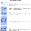 Modern problems of science and education
 Smart books for smart people: review